
This guide takes you from installing the plugin to a published timeline. You will see the setup screen that appears the first time you add the block, the two ways to start (a ready-made design or your own choices), and where to find the settings once the timeline is on the page.
Install the plugin
Advanced Timeline Block is free on WordPress.org. In your dashboard, go to Plugins → Add New Plugin, search for “Advanced Timeline Block”, then install and activate it. Version 3.0 needs WordPress 6.6 or newer and PHP 7.4 or newer.
Activation adds a page under Settings → Timeline Block with a quick start and an overview of what the plugin includes. You do not need to configure anything there before you begin. Everything about a timeline is set on the block itself.
Add the block
Open any post or page in the block editor. Click the + inserter and search for “timeline”, or type /timeline on an empty line and press Enter. The block is called Timeline and sits in the inserter’s Timeline Block category.
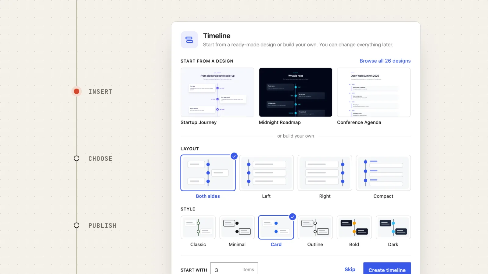
Instead of an empty block, you get a setup screen. It only appears for a timeline you have just inserted, never for one that is already in your content.
Start from a ready-made design
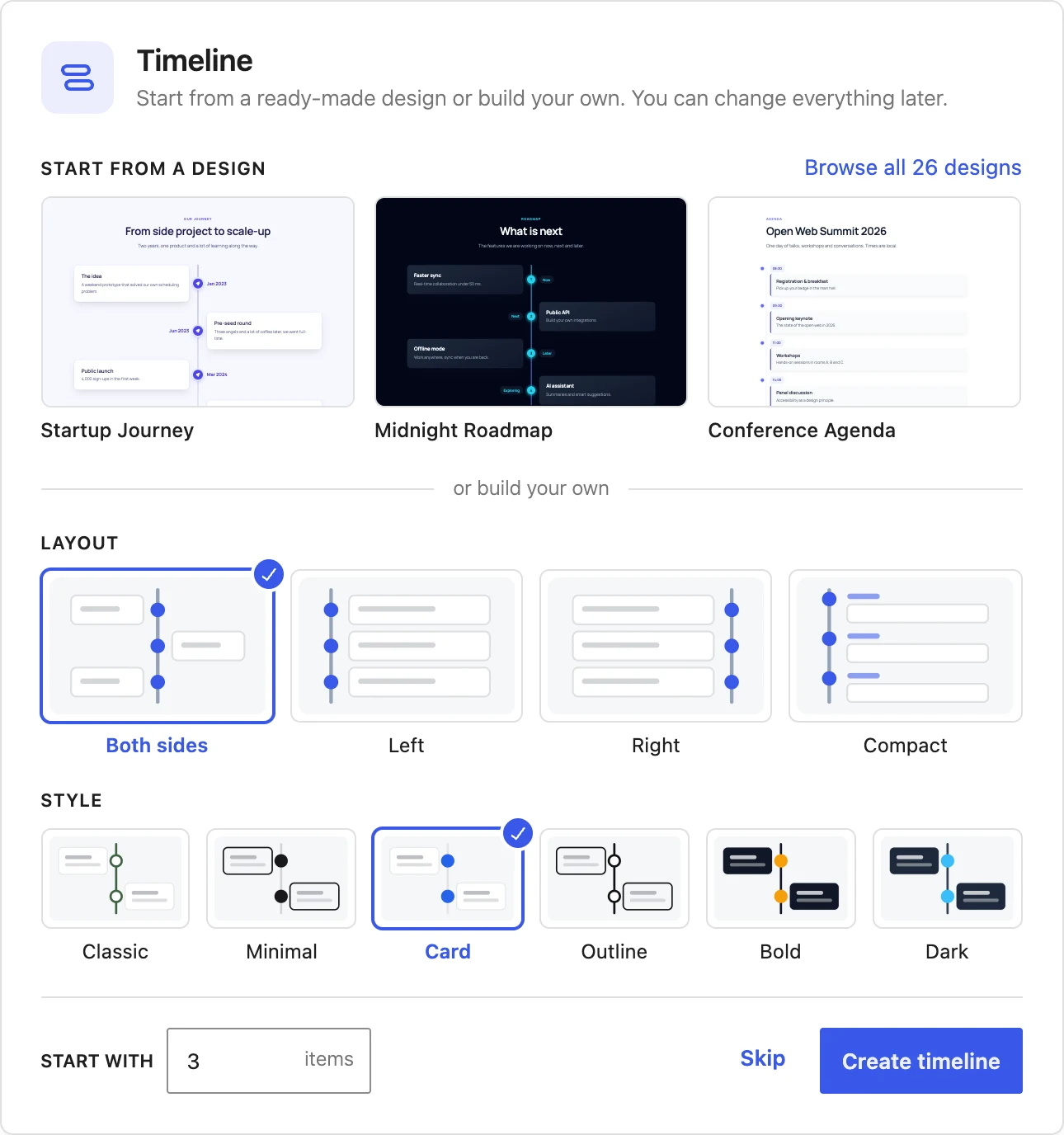
The top half of the setup screen shows three featured designs. Click one and the block is replaced by a complete section: a heading, an introduction and a timeline with sample content, already styled. You then edit the text in place.
To see every option, click Browse all 26 designs. This opens a full-screen browser with a live preview of each design and a search field, so typing “roadmap” or “wedding” narrows the list.
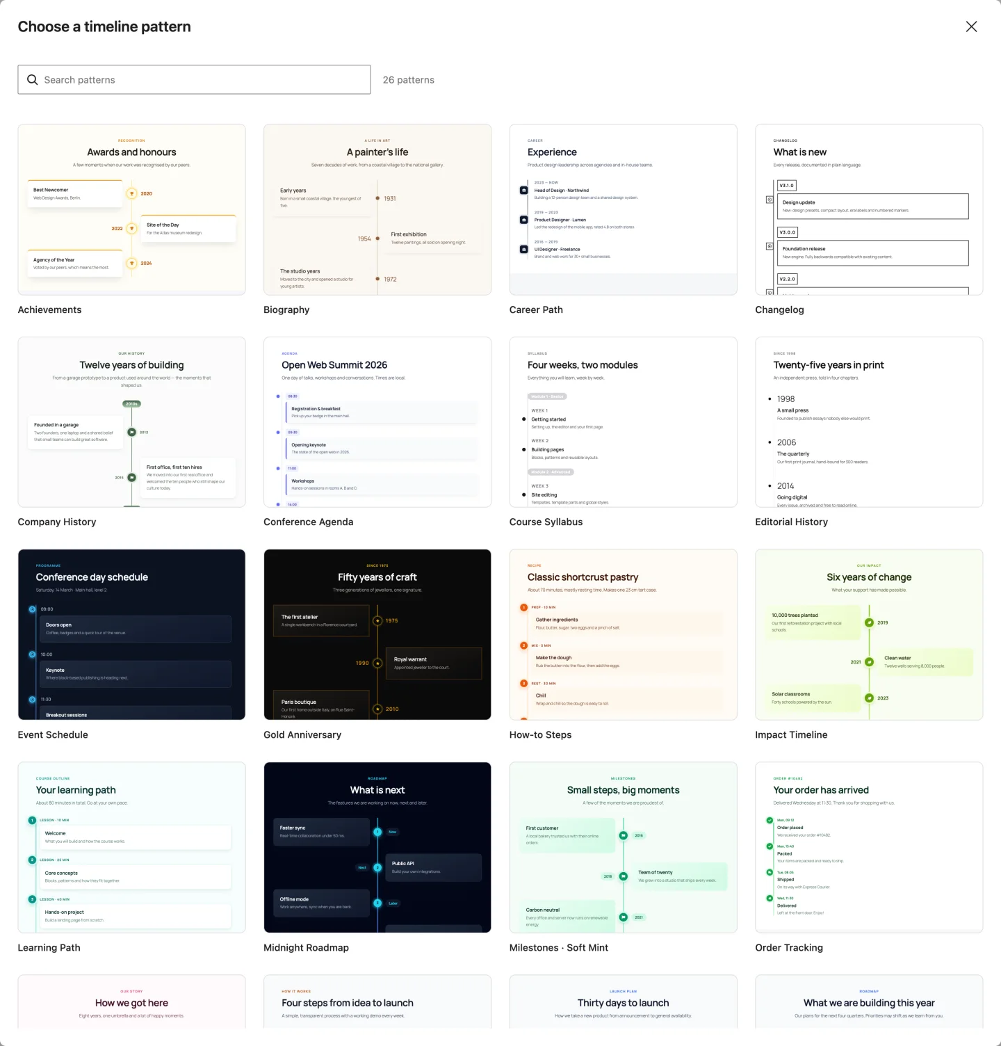
The same 26 sections are available later in the block inserter, under the Patterns tab in the Timeline category. Each one sets its own typography so it looks the same in most themes, and each is a normal timeline block underneath: every setting described below still applies.
Or build your own
Below or build your own are three choices:
- Layout: Both sides, Left, Right or Compact. Both sides alternates items around a centred line. Left and Right put the line at one edge. Compact is a single column with the date above each item.
- Style: one of the six design presets (Classic, Minimal, Card, Outline, Bold, Dark). Card is selected to begin with.
- Start with: how many empty items to create, from 1 to 12. The default is 3.
Click Create timeline and the block appears with those items. If you would rather set everything by hand, Skip closes the setup screen and leaves a single empty item with the default settings. Nothing you pick here is final; all of it can be changed from the sidebar afterwards.
Write your items
Each item has two parts. The small label next to the marker is the date or name; its placeholder reads “Event name/date..”, and it can hold a year, a time, a version number or a word like “Today”. The content box beside it holds regular blocks. It starts with a paragraph, but you can add a heading, an image, a list or a button inside it, just as you would anywhere else in the editor.
To add more items, select an item and use Add item after in its toolbar, or click Add Timeline Item below the timeline. The button next to it, Add Era Label, inserts a label that sits on the line between items, such as a decade or a project phase. Items can be reordered with the usual block mover arrows or by dragging.
Where the settings live
Select the timeline itself (not an item inside it) to see its settings in the sidebar. The sidebar has two tabs:
- Settings (the gear icon) holds the structure: Layout, Design (the six presets), Marker (icon, dot or number, and which icon), Date or Name and Advanced.
- Styles (the half-filled circle) holds every visual option: Content box, Date or Name, Marker and Connector line, with colours, borders, radius, padding, shadows and hover effects.
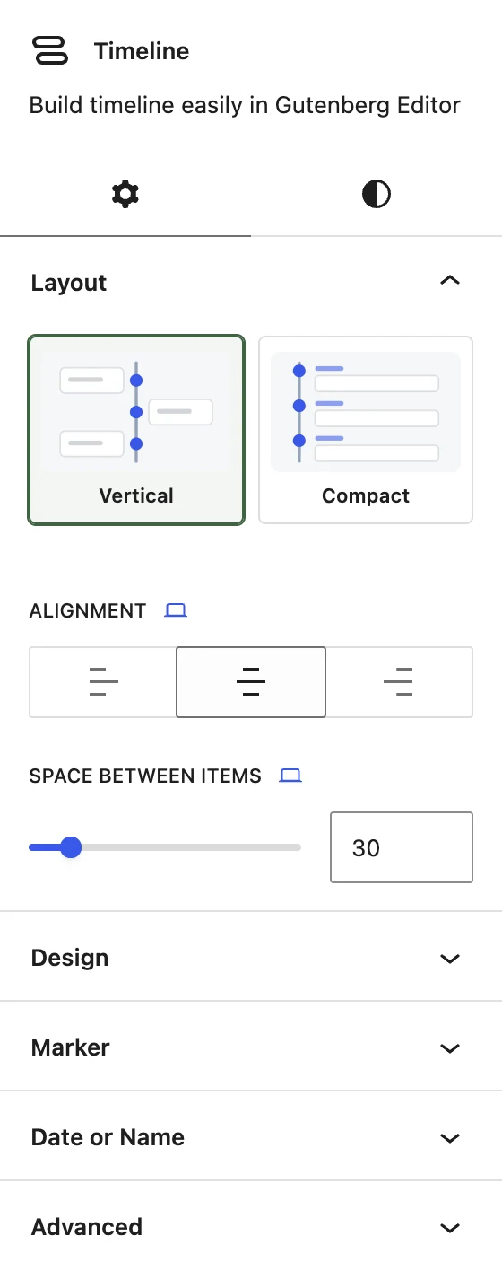
A small device icon next to a field label means the value can differ between desktop, tablet and mobile. The device follows the editor’s own preview switcher, so when you preview on mobile, you are editing the mobile value. The curved arrow next to a field resets it.
Publish and check the result
Publish or update the page and open it. The timeline is plain HTML and CSS: the plugin loads one stylesheet and no JavaScript on your pages, and the markers are inline SVG rather than an icon font.
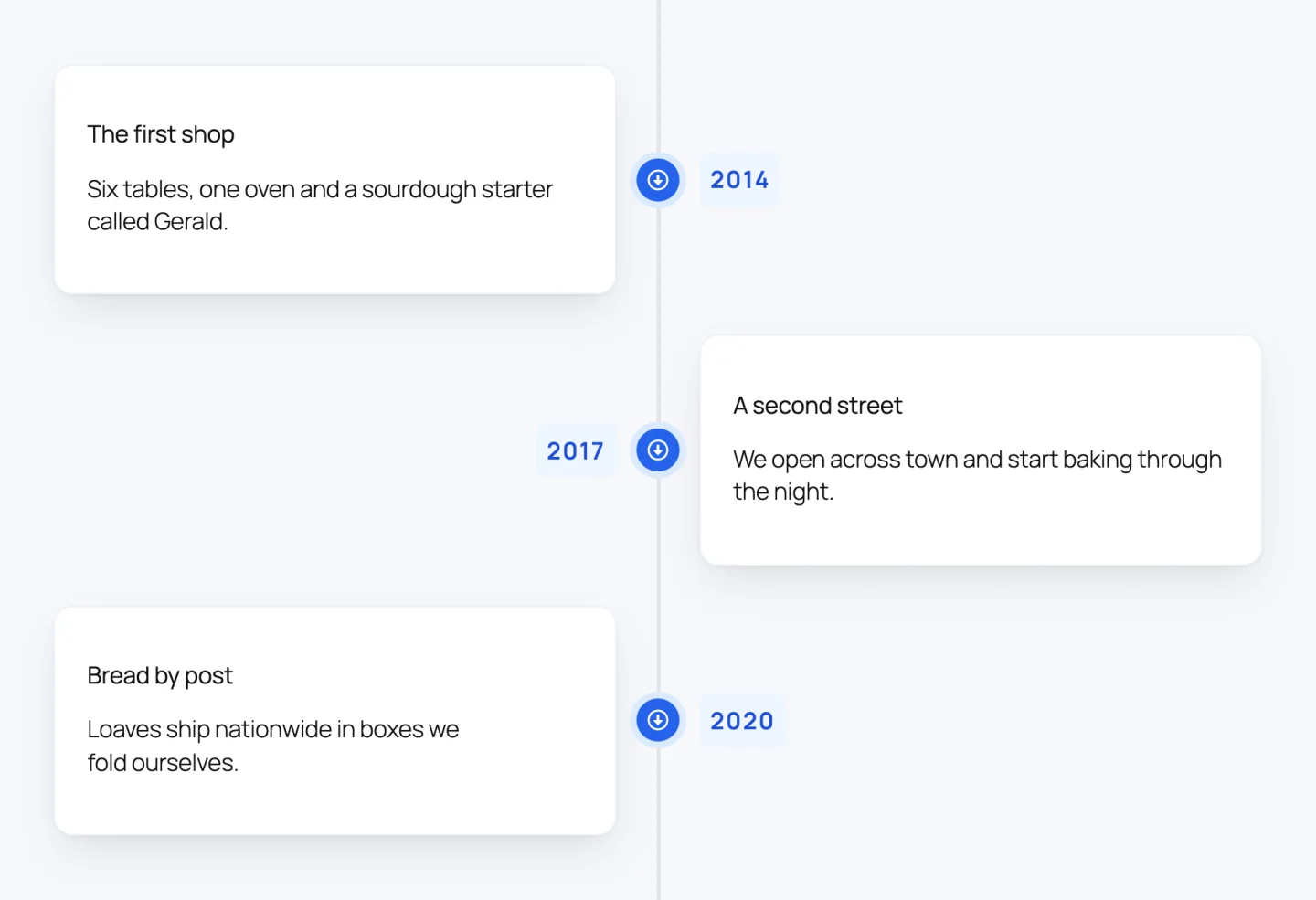
Before you share the page, resize your browser or open it on a phone. The Both sides layout switches to a left-aligned line on mobile by default, which is usually what you want, but long titles and dates are worth a look at that width.
From here, the quickest way to learn the block is to insert two or three of the ready-made designs on a draft page and open their settings to see how they were built. The presets on our homepage show the six styles side by side if you want to compare them first.